Anwaliya
Crafting Handmade
Helping hard-working potters and artisans from all over India
Anwaliya is a home-grown brand that was established in 2018, with a vision to help the hard-working potters and artisans of India.
Due to cheap imported products with a variety of designs and highly competitive prices, Indian potters are not able to compete with the products So, Anwaliya came into action to help them give insights of the latest culture and designs which help them to make product up to the mark of imported products.
Anwaliya’s mission is to provide the best quality products without any harmful chemicals which are far better than machine-made full of chemical products.
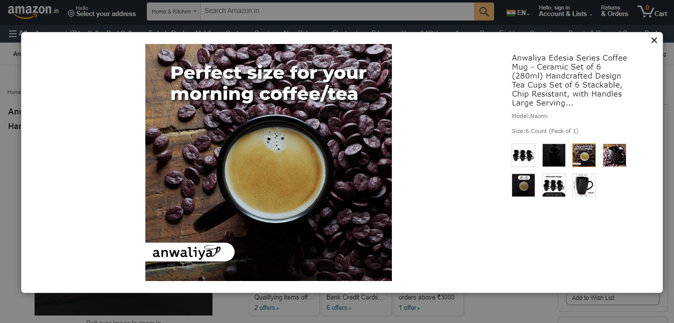
I helped them for the 3D renders and composition for the amazon listing images. The product I helped them for is an Edesia Series Black Coffee Mug. You can check it out here.
PROJECT SCOPE
Art Direction | Modeling | Texturing | Short Copy | Infographics
The process
It was fairly simple to model a coffee mug, it is mostly a beginner level modeling that you learn when you start your 3D journey.
It is the other parts where it was most of the efforts. Lighting, textures, coffee beans, references, etc.
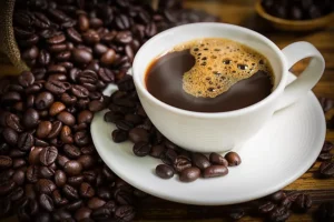
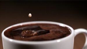
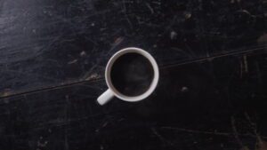
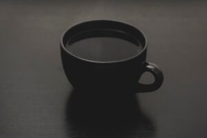
First, I took some inspirations from references I found on the internet for the lighting and scene setup.
These were some of them:
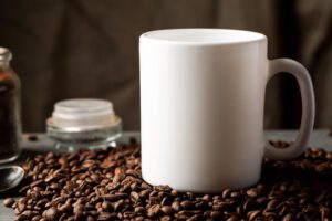
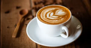
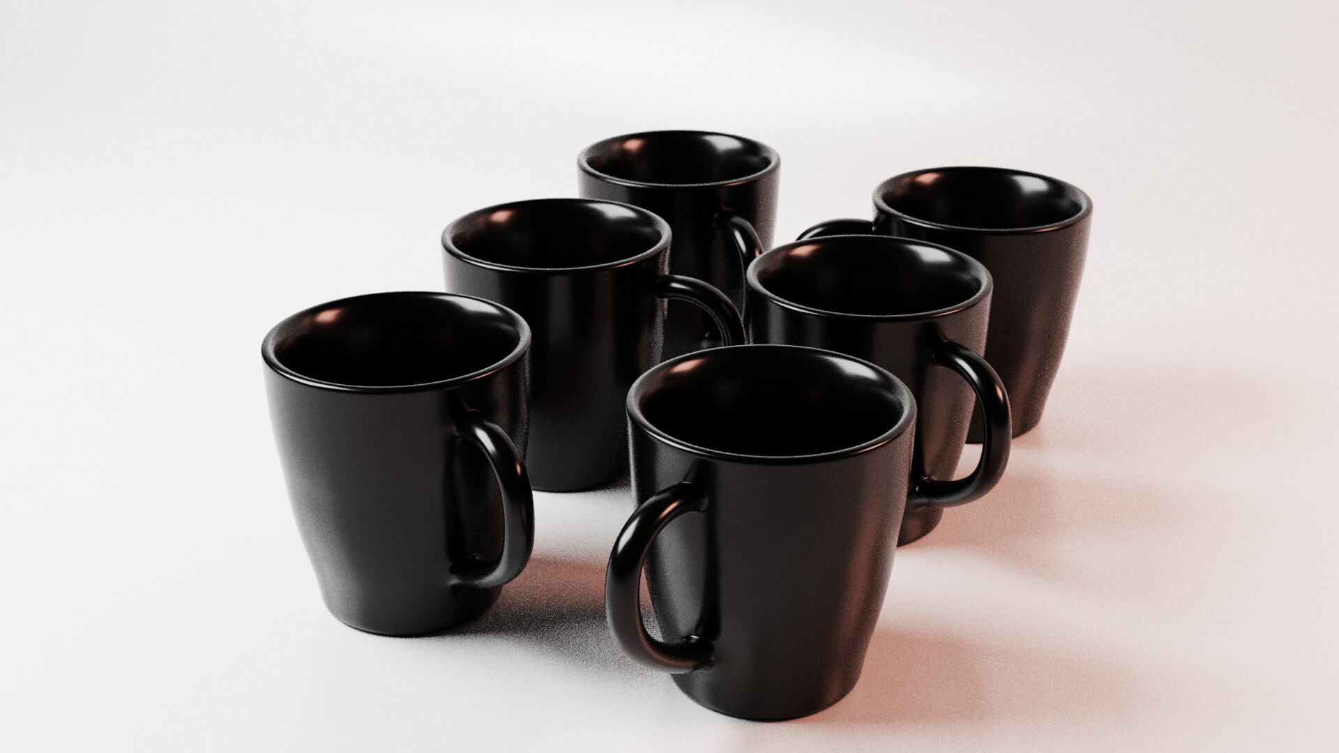
So, with the references in place, I started modeling the mugs according to the product.
At first, I came up with this:
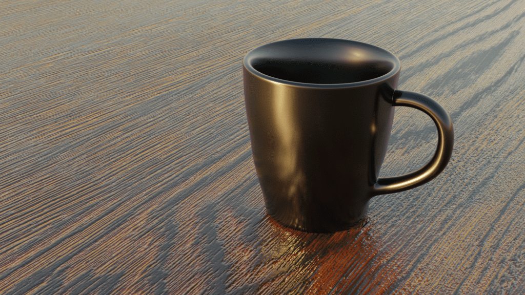
BORING!
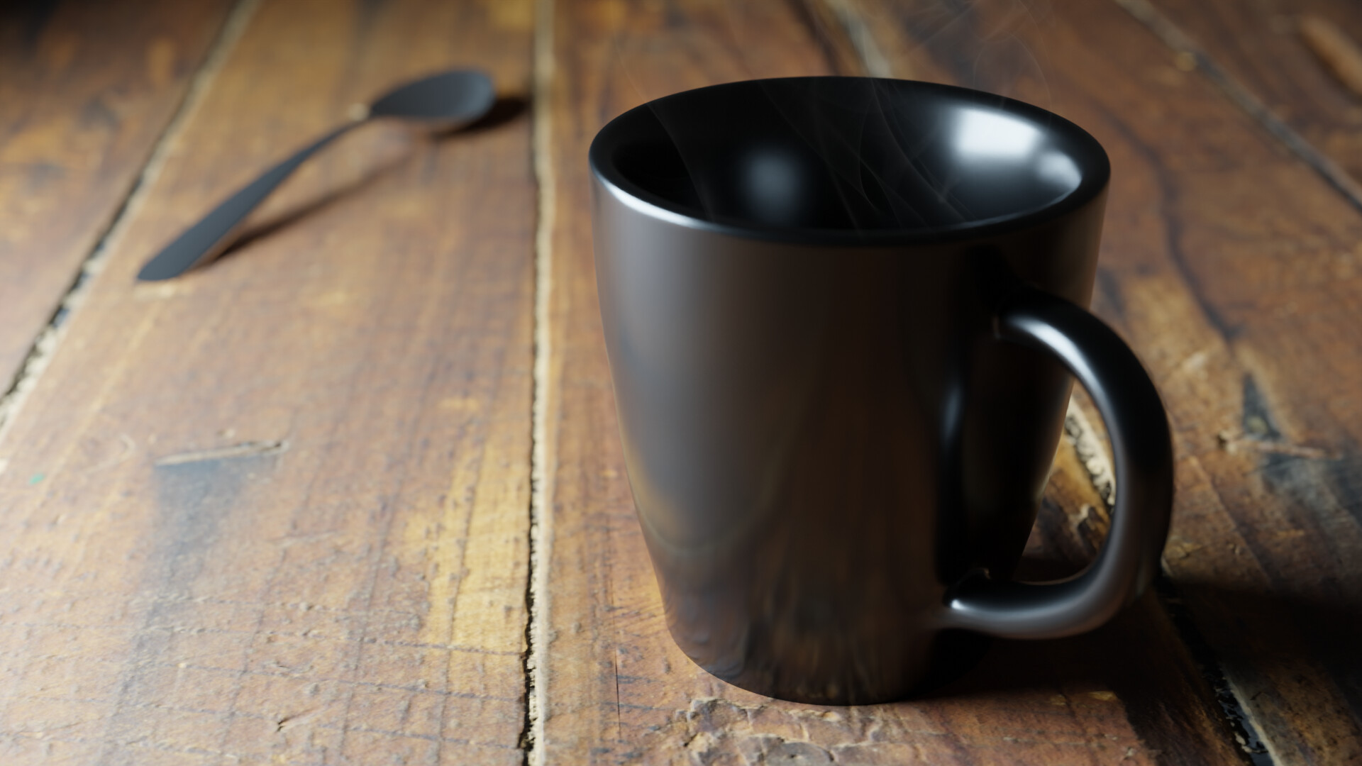
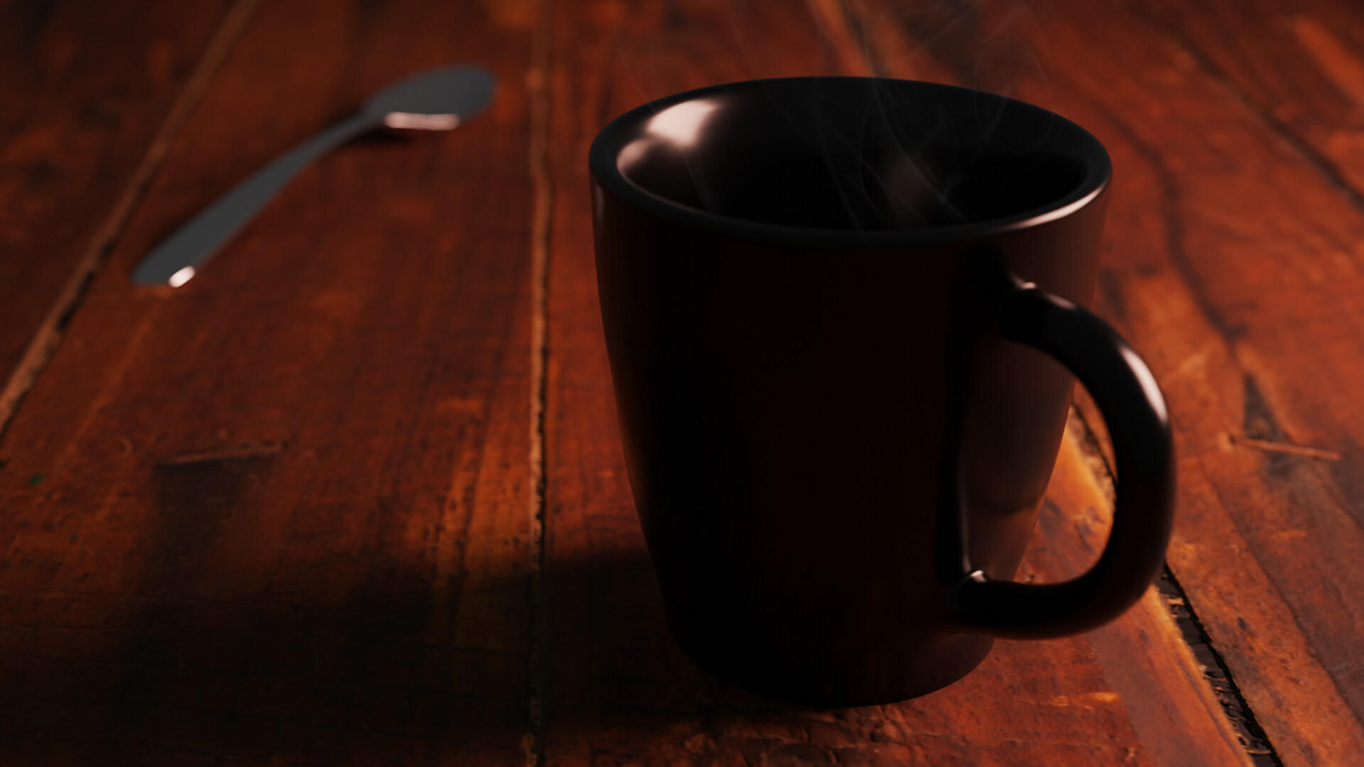
So this is when the lighting and composition takes place. With the help of the references I found and my vision on top of them, I turned that boring image above and turned it into this:
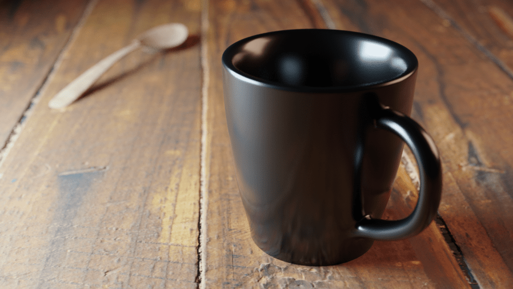
Much better now, isn’t it? I took the texture of the table from polyhaven website.
But that’s not all, I experimented with the coffee beans, with different lighting and with different textures too, along with different lighting setups. You’ll see them later.
One more thing I showed in it was the coffee.
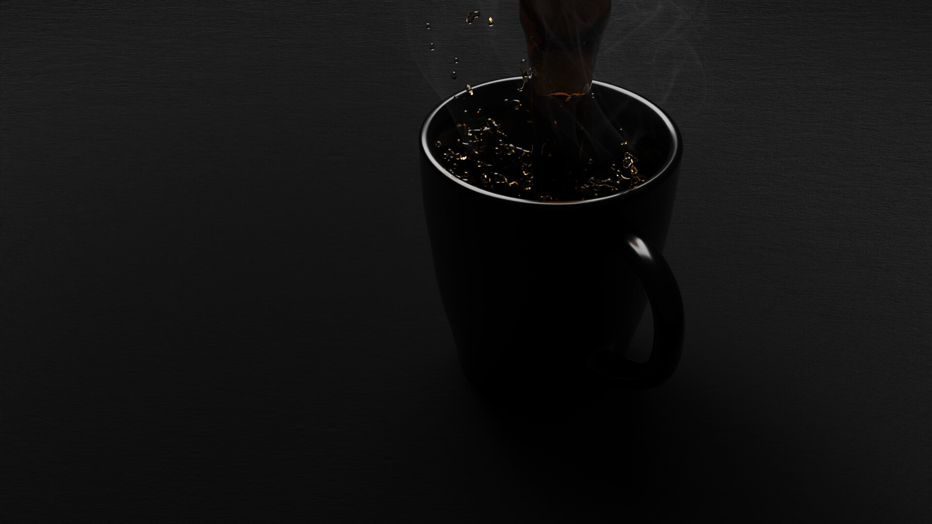
Now, I wanted to do the coffee procedurally. Which is, to have a liquid simulation to give realistic physics to coffee so that it looks good.
I was able to succeed with plain black coffee but the milk coffee with the bubbles and coffee art is pretty much impossible to do, as far as I know.
So, I used the good ol- textures for that.
I took the coffee texture from this (it is a cc0 licensed image, don’t worry):
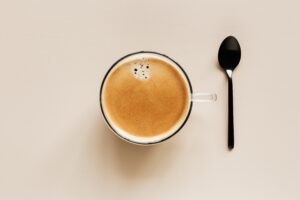
And put it in the mug:
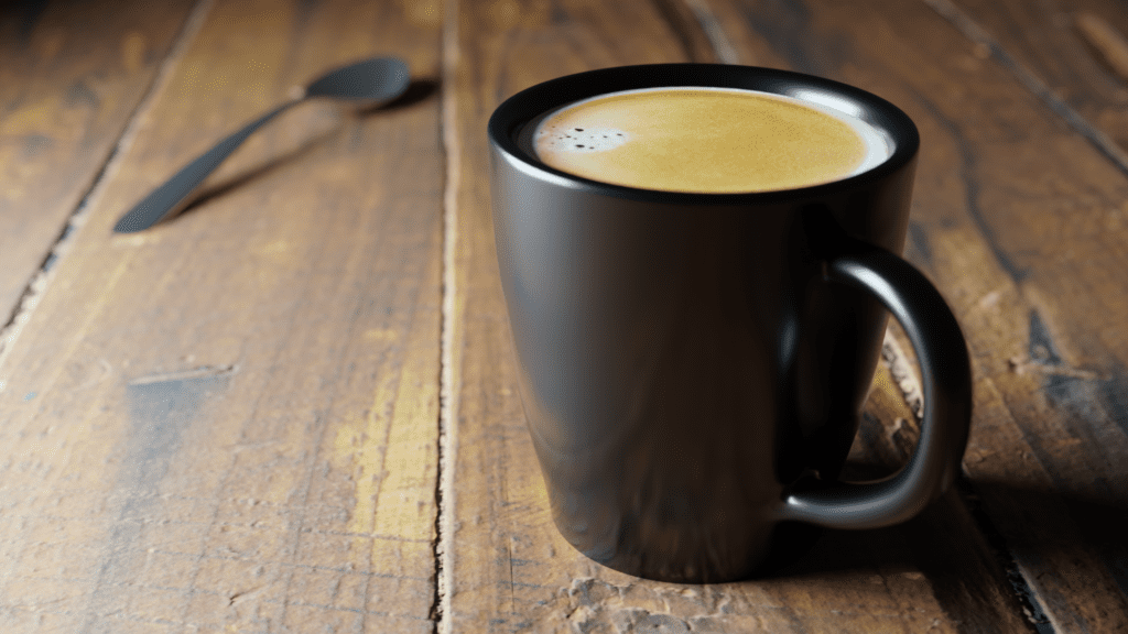
Now, something was off. To me it doesn’t look real.
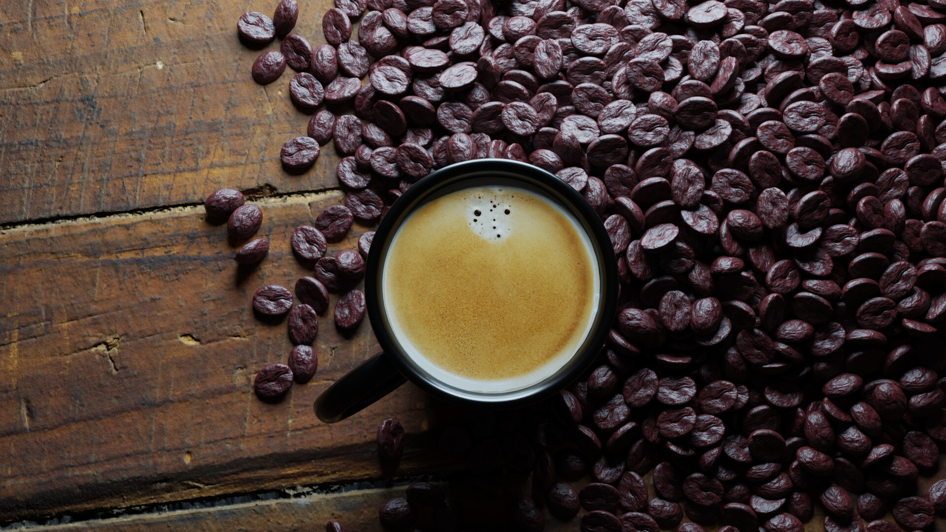
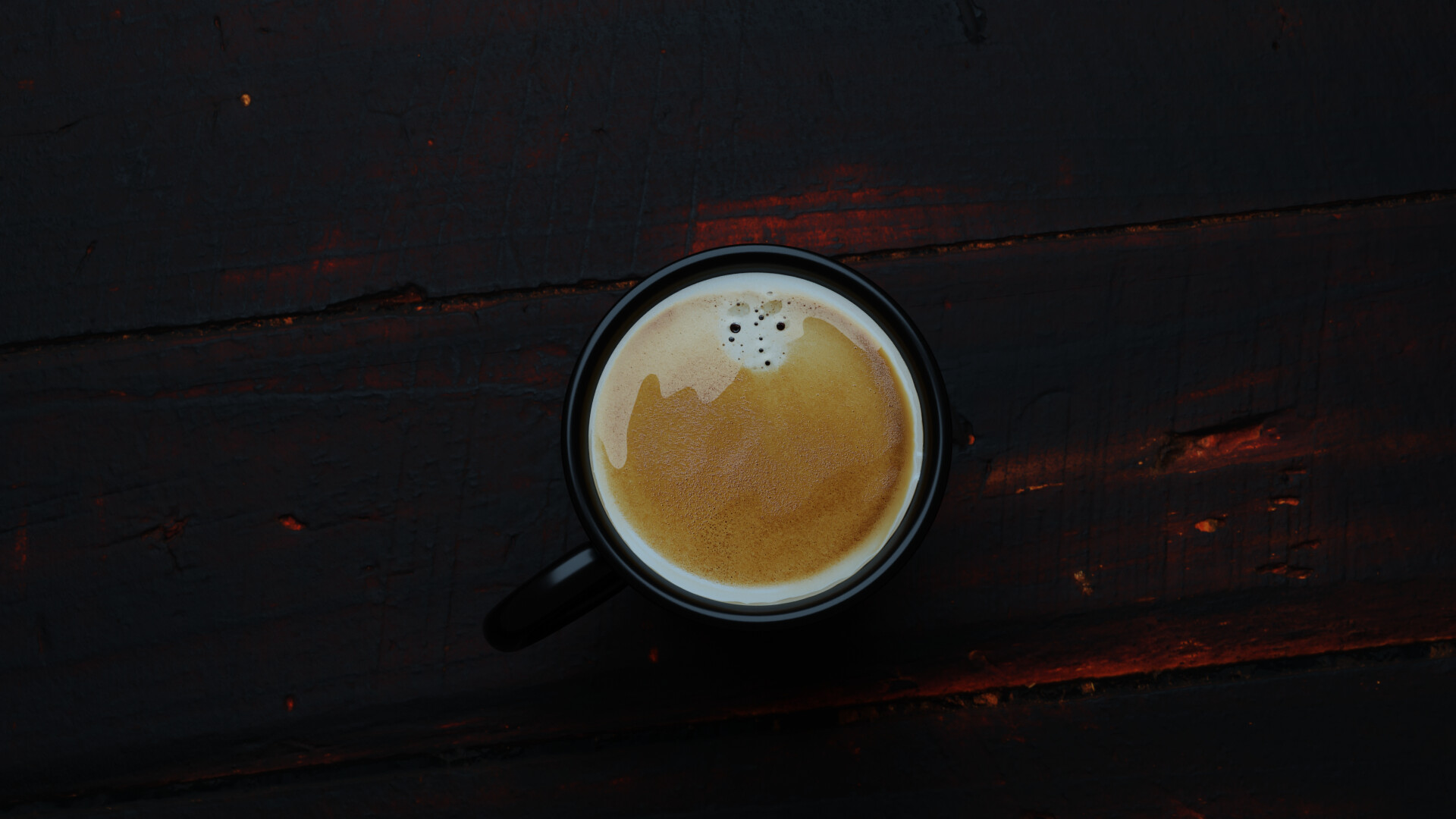
Of course, the original image was from top view, so to make it look the most real, this should also be from the top view.
So, that’s what I did:
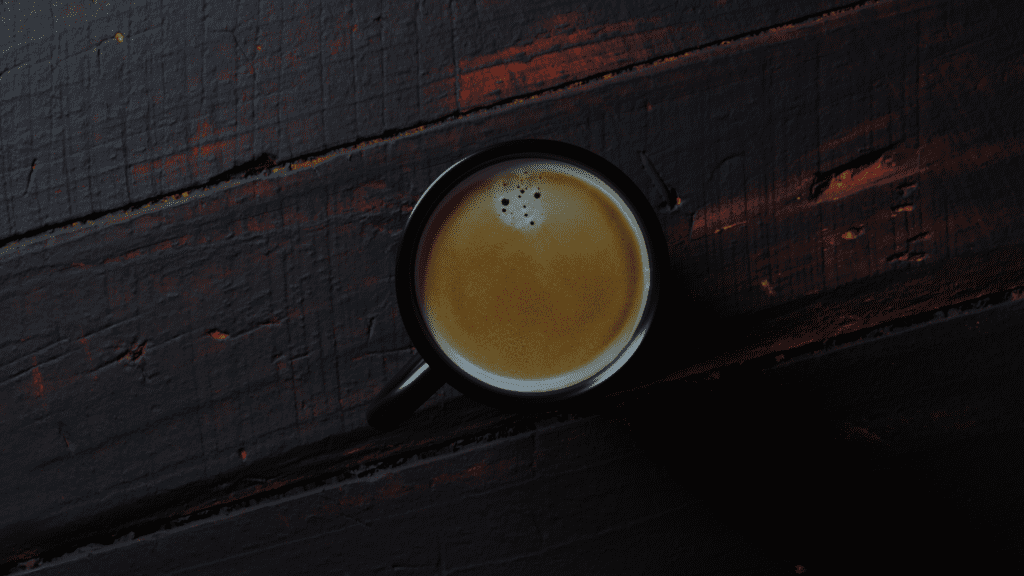
Looks better, right? I mean, the real simulation would’ve been the best, but we already have a shot for that so I think this is alright for this project.
The rest of the project was just experimentation with lighting, with color, with different textures and composition and it was overall fun.


